Following two days of innovation and learning with Design and Brand Strategists at the combined FUSE & Shopper Insights conferences in Amsterdam, I'm still sorting my reds, whites, blues, oranges and greens (read on to find out why green wins for me). However, for the benefit of the color-critical few that could not join the event, and before the myriad of thoughts blur quickly back to the highly chromatic day-to-day, I thought I'd share my reflections on learnings from our leaders in design and marketing strategy, in particular the role of color, and the increasing need for specificity, flexibility, and consistency in our digital world.
Color is a pivotal element of design strategy, and a core communications tool for the designers that use it...
As our world (color being part of this) goes increasingly digital, I couldn't help but notice that the vast majority of speakers at this event were reminding the audience that we humans are still physical beings. From a conundrum such as 'software vs soft-cell' at the heart of the tech strategy of the City of Amsterdam, to a reminder by Facebook's Creative Strategist that technology is making us more human (ultimately, people are being inspired by people), the culture of fearless start-ups is reminding big brands that it's alright to make bold moves that tell people how you feel, and ultimately express your DNA, or brand promise. Design leaders were reminding us all, that in spite of technology and the speed of innovation today, we are still people. People driving business and technology, and people consuming what business produces.
Lest we forget, lest we be driven.
On driving, visionary car designer Frank Stephenson (think new MINI, Fiat 500, iconic race cars and more) spoke of bio-mimicry and the beauty and speed that can be achieved when we follow the magic of nature, but also reassured us about the future of safe transport in both the electric and vertical (flying taxis) sense. But, when the dust settled, the aspect of Frank Stephenson's approach that most struck me was his insistence on finding the right engineers (not tools) that are willing to push the limits to achieve the collective vision. Ultimately, the success of the McLaren P1 was, of course, about innovation and beauty, but that vision was shared and driven (forgive the pun) by a team of creative designers and practical engineers that found harmony in the collective spirit of innovation. It's the humans that pushed the limits of technology.
Why does this matter to design and communication at the speed of color?
Well, because humans still choose the colors, make the designs that attract our attention and manage the teams and processes that create the colors on the products that attract our dollars, euros, pounds, yen... So, there's the link between color, humans and now speed. Pantone VP and General Manager, Adrián Fernández reminded us that understanding how color works is the start of communication success, but unravelling the fear and myths of specificity is the key to enabling designers to close the gap between inspiration and achievement of consistent color across multiple print runs and/or multiple materials.
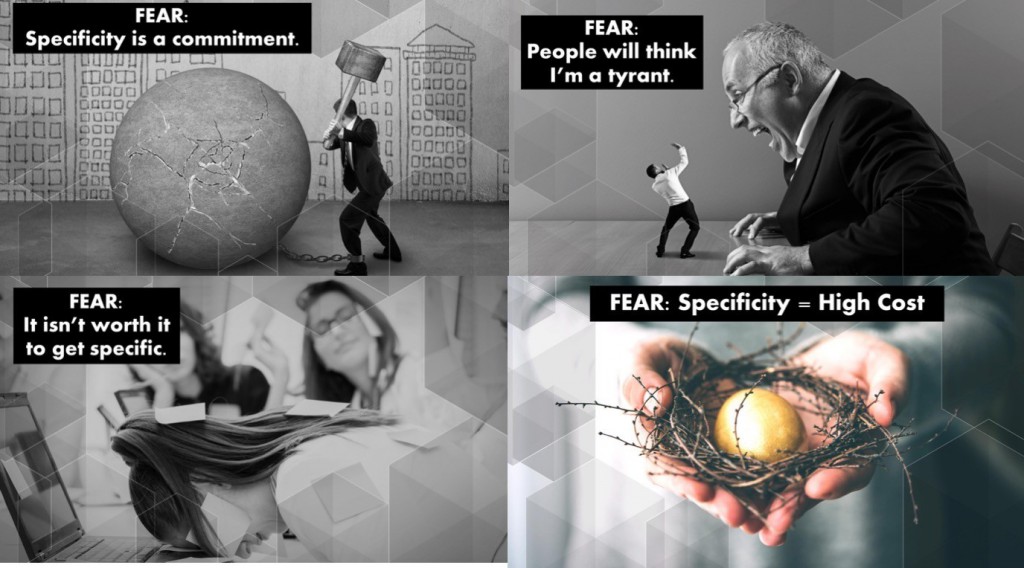
The recurring fears and myths of [color] specificity:
In reality, specificity unlocks creativity and gives confidence during color selection, and being clear about decisions makes one a leader, not a tyrant. Most importantly, specificity brings portability to ideas and allows for maximum flexibility. As for the cost, once endless trial and error are removed, the savings are made.
This seems simple, but in practice, over 80% of designers* have insufficient knowledge about how the color they choose in a creative stage will be reproduced in the reality of production and manufacturing, and, with the processes moving faster than ever before, it really is critical to close the gap and to start communicating (and specifying) better within and between our creative and production teams. When we stop, or when we don't, we can get stuck in the 'messy middle', a place that our X-Rite colleagues explain is easy to avoid. All we humans need to do is talk to each other, specifically.
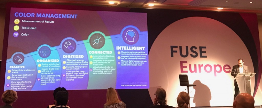
Adrián went on to share a framework called the Digital Maturity Model. Based on extensive experience with brand packaging, this multi-dimension model helps teams to understand better how and why they manage color the way they do, but more importantly, the tools and processes that can enable them to do so more efficiently, and therefore more intelligently. Ultimately, digitization and tools are part of the progression. However, in closing, someone asked about the best 'tools' for the job, for successful color management - could Pantone recommend one, or a few? Unbeknownst to Adrián (first speaker of the event) his response started the resounding echo of "human" and "people" themes that followed consistently over two days:
Apart from the combination of physical and digital color standards and references that teams rely on to communicate color, Adrián emphasized that, beyond the solutions that Pantone offers, some of the critical tools for success in color management lie in the hands of the design leaders (people) that clearly communicate their vision, and specify or mandate their color wishes and needs with their teams and supply chains. Mandating doesn't make them tyrants, and it's not always easy. But, it makes them leaders, and it helps their teams to succeed.
Speaking of not easy, in my closing remarks, I'd like to pay tribute to The Greens.
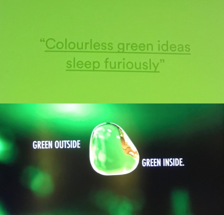
Two brands closed the event remarking that it's "not easy being green", but it sure is fun. Body Shop former Creative Director Emma Booty extolled the virtues of joyful radicals and collaboration and reminded us that 'colorless green' still has value, meaning and human spirit to be shared, and that successful brand guidelines are shared, visualized and lived, as well as communicated. The event concluded with The Heineken Experience, and left nobody in doubt of the color of success. Telling the story of the attention paid to process and global teamwork, Mark van Iterson, Global Head of Design and his team at Heineken, are living examples of that success, thanks to a commitment to iconic consistency, color, and creative flexibility.
So, here's to great human design leaders of today and tomorrow!
*Pantone Color Institute research 2018


