Just water
This Week In Design & Brand Strategy: 8/31/15 - 9/4/15

 Design, if it hadn't already, is beginning to impact the environmental-friendly world. According to an article on Fast Company, a new startup by the name of 'Just Water' is launching their first product for an incredibly eco-friendly water bottle. The way the CEO, Grace Jeon, sees it, ''We would never tell people to drink this instead of what's coming out of their tap'but we know that packaged water or bottled water isn't going away.'' So what's so special about this bottle of water? This new bottle is made up of half paper having an inner lining similar to that of coconut water, 'The design cuts the carbon footprint of making the package in half (unlike something like the PlantBottle, which has a carbon footprint only around 11% better than normal plastic).' The overall message from this design and company is this: Drink tap water as much as you possibly can. However, if you find yourself in a situation where bottled water is absolutely necessary, purchasing 'Just Water' will decrease your carbon footprint significantly in comparison to other bottled water options.
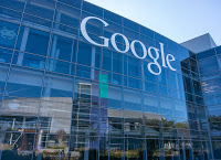
 Everyone is familiar with the Google logo right? Well, this week on Tuesday Google introduced a new and updated logo that is essentially the biggest update the company has undergone in 16 years. The notable changes include a newer sans serif typeface, brighter colors (even though the color scheme is the same), and is actually animated now. 'Google went from being the way we find trivia to becoming the digital infrastructure of our lives. And in turn, they've created a new logo and brand identity'' This design move is huge for the company as its releasing many new ideas this year including its sister company 'Alphabet' (discussed in an earlier post), and cars that 'don't need you to drive them.' The iconic 'G' of this new logo will be rendered in the four colors of the full Google logo. Curious to see what this new logo looks like eh? Check out Fast Company's article and analysis of the design.
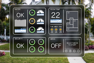
 Most of us have seen the commercials for the Nest thermostat, and if you haven't, they typically feature an individual complaining about the thermostat due to its superior 'brain' and skills. This week Fast Company featured an article about this thermostat because it just announced a new generation thermostat that apparently holds 3 of the most common design trends of the day. The first trend included is that ''the user interface reacts dynamically ' to more than touch.' In other words, as you get closer the thermostat, it reveals more and more information to you. Another design trend is its round screen interface. In older versions of the Nest, the screen was encapsulated by a round frame but still had a rectangular face; the newest version features round face. Finally, the third trend this new gadget embodies is that it has a much larger screen like many smartphones today. It's much easier to read, but it also means they had to redesign the arrangement of its internal chips. Learn more about this new gadget and its cool new design by reading the article here.
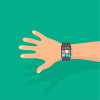
 According to an article released this week by Fast Company, the Motorola just unveiled its Moto 360 smartwatch and designed it in a way that looks more like a regular watch. To separate itself from the Apple Watch, the new Moto 360 sports a leather, NATO-style band. ''the new Moto 360 has experienced a relatively significant redesign. While the thickness remains relatively unchanged, its perfect circle of a case has been fitted with lugs (what you may know better as those protruding hooks that allow you to connect new bands).' This new watch will be the first in its kind to look more like a traditional watch while still holding the capability of a smart watch. The designers explain that the reason behind this shift was not just because it looked better as on old-fashioned watch, but because the round design simply feel more comfortable on the arm. To be honest, this new design probably does feel snugger on the wrist, while also looking more fashionable.
Nichole Dicharry, is a Digital Marketing Assistant at IIR USA, Marketing and Finance Divisions, who works on various aspects of the industry including social media, marketing analysis and media. She can be reached at Ndicharry@iirusa.com