10 Best Company Logos of All Time

A logo is the face of a company. It has a huge influence on your brand’s visual identity, the way consumers perceive your brand, and even the associations consumers make with your organization. To demonstrate the power of a memorable logo, we compiled a list of the best, or most revered and talked about, company logos. These logos have stood the test of time, carrying the brands’ essence throughout the years but also growing and evolving along with them.
What makes a good logo?
There are many factors that make a logo ‘good’. Visual elements that follow established logo design principles, meaningful typography and a balanced colour palette are some of the ingredients for a good logo recipe. It should be relevant to the brand and its story for many years to come, tell you something about its customers, and be simple enough to understand. Unfortunately, it’s not as simple as it sounds.
10 Best Company Logos to Inspire:
- Starbucks: the imperfect one
The two-tailed siren appeared in the Starbucks restaurants in 1971. Inspired by the Italian medieval character “Norse”, the Starbucks mermaid was re-designed several times since it was created, and notably made less symmetrical a few years back, helping the logo be more approachable and “human”. As Starbucks grew and established its brand presence across the world, the company decided to eliminate their name from the logo and have the siren speak for herself. This reflected the brand’s iconic status, whereas the trademark green colour is now recognized by anyone who’s heard of Starbucks.
- Nike: the $35 dollar one
It’s well-known that the creator of the famous Nike “swoosh”, Carolyn Davidson, was initially paid $35 for her logo work (she was later rewarded with gifts for her contribution to Nike). Although the logo has been tweaked several times since 1971, the swoosh always represented the dynamism and speed of athletes that Nike targets. Other than being a clean and beautiful icon, the logo also translates the meaning behind Nike’s name - it represents the wing of Nike, the Greek Goddess of Victory.
- Apple: the deliciously simple one
Interestingly, the original Apple logo carried a different meaning of the word ‘apple’. It featured Isaac Newton, who created the law of universal gravitation after an apple fell on his head. To reflect the company’s drive for the future and to make the design more visible in smaller sizes, Steve Jobs proposed the now-classic design of the bitten apple. The logo was first rainbow-striped and included the name “Apple”, but later the company changed it to a single colour design. The new logo represents Apple’s simplicity and drive to be different. Steve Jobs’ description of the company’s logo fits it very well: “The fruit of creation, Apple. It was simple but strong”.
- McDonald’s: the instantly recognizable one
When you see McDonald’s golden arches, you immediately think of Happy Meals and Big Macs. That’s how powerful their logo is today. Compared to the previous examples, McDonald’s thought of more practical reasons when developing their logo. Initially, the logo had many small elements like overlapping texts and lines. But eventually, those elements were eliminated and the modern-day logo was designed to be seen from afar,catching the eyes of hungry customers. This allowed McDonald’s to create an image that was instantly recognizable to anyone passing their restaurants.
- Coca-Cola: the Christmas-y one
Unlike other companies, Coca-Cola didn’t steer away from its original logo design. It was developed by Frank Mason Robinson in 1886 who thought that the curly C’s “would look well in advertising”. It’s a great example of a company that used a custom font to differentiate itself from other brands. The colour red was introduced in the 1950s to attract younger consumers. Throughout various logo changes, Coca-Cola’s red and white colour palette denoted energy, excitement and passion. These meanings were even translated into Coca-Cola’s holiday advertising - thanks to the brand’s extensive Christmas marketing activities, red and white are widely associated with Santa Claus and Coca-Cola.
- FedEx: the award-winning one
The patriotic red and blue colours on the FedEx logo were incorporated to associate the brand with the US. After shortening its name from ‘Federal Express’ to simply ‘FedEx’, the company created a new logo in 1994. FedEx’s logo is one of the most creative logos in our list because it has won 40 awards for its smart design and use of negative space. Look at the white space between the letters ‘E’ and ‘x’ - can you see the arrow? It signifies direction, precision and speed. That’s where the minimalism and charm of the FedEx logo lies.
- Amazon: the everything-under-the-sun one
Amazon is another company that uses arrows to indicate certain meanings. Having expanded its horizons from bookselling to selling… absolutely everything, Amazon needed a logo that conveyed this message. That’s what the arrow signifies - it moves from the letter ‘A’ to ‘Z’ to show that the company sells anything you like from A to Z. The arch of the arrow also symbolizes the smile of their happy customers, whereas the orange colour connotes joy and pride. This is how Amazon wants its customers to feel whenever they shop with them.
- Toyota: the culturally relevant one
What sets Toyota apart from other logos is that it’s meaningful for English speakers while staying true to Japanese culture. On the one hand, the 3 ovals that make up the logo reveal each letter of the company’s name in English. On the other hand, each oval has a different stroke thickness, just like the strokes in Japanese calligraphy. Toyota also states that the ovals signify three cultural elements of the company: progress, team spirit and freedom. Their logo works not only because of its well-structured design but also because it tells the story of the brand.
- Adidas: the literal one
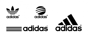
Over its history, Adidas created 4 different logos that it still uses for different product lines. But what remains unchanged are the three stripes which the company applies in all of its branding work. Originally, the stripes were used as stabilizing strips on Adidas’s track spikes. The stripes proved to be simple and versatile enough to apply them in all the logo variations. Adidas’s logo is an example of a creative logo design that is practical, descriptive of their products’ original use cases, and unique in its design.
- Mercedes-Benz: the family-matters one
Mercedes-Benz’s logo takes inspiration from a family artifact that belonged to the brothers Paul and Adolf Daimler, sons of the company’s co-founder Karl Benz. While designing the logo, the brothers recalled a picture of a star drawn by their father in a letter to their mother. This star, which was a symbol of hope that one day their factory will face prosperity, became the basis of the 3-pointed star that eventually became Mercedes-Benz’s logo. It signifies three types of mobility and the company’s aspirations to dominate those spaces: land, water and the air. What started as a familial emblem a century ago became the icon for one of the world’s most luxurious brands today.
We hope this list of the 10 best company logos inspired you; each logo is unique, appeals to their audience, is easily recognizable, and tells us something about the brand itself..
That’s why it’s so important to test your creative logo design ideas before launching them in-market. At Upsiide, we test logos all the time. Book a demo with us to give it a go and find out which logo ideas have the most potential for success within your target market.
