Best Practices in Creating Mobile Websites: Live at #TMMC

The afternoon workshop at The Mobile Marketing Conference began with attendees identifying which aspects of mobile web design and development they were interested in. Interestingly, many attendees mentioned that they were relatively new to mobile and looking for a "crash course" from this workshop.
To provide a crash course to you our readers, here are some key takeaways from the session.
First, Stephen lead us through a quick vocabulary lesson, including:
Feature Phone
"Dumb Phone" - basic phone with some apps, but not many features
Smart Phone
Mobile web vs desktop web
OMA: Open Mobile Alliance
WAP: wireless access protocol
WML: Wireless markup language (In WML, sites are decks, a page is a card)
XML: Extensible Markup Language
XHTML/XHTML MP: eXtensible HyperText Markup Language and eXtensible HyperText Markup Language Mobile Protocol
Native Apps
iOS
Webkit: Layout engine that powers many mobile browsers
Next, we covered the rise of mobile:
First, the internet made the world a lot smaller by providing socialization, shopping and learning online, but that was still an activity. Mobile presented a shift by placing the internet out in the world. 80% of people use mobile during miscellaneous downtime. Mobile is now layered on top of activities such as waiting, watching TV, or shopping in store.
Technology and mobile are imposing behaviors on culture and society. People are now becoming brands: providing interesting content or experiences. For many around the world, mobile is actually the only connection to the internet. 3.6 Billion people have a smartphone, and by halfway through this year, half of America will have a smartphone. Mobile is now growing faster than any technology in history.
Next, we talked about the difference between mobile web, hybrid apps and native apps.
In a side by side comparison, mobile apps are less portable between platforms, apps are harder to link to from outside, and can face problems with distribution via the app store, mobile web needs less promotion and can be found on search easily, additionally mobile web development costs are usually lower than app development. However, apps do have some aspects where they are stronger. It is easier to have more control over design and functionality and users can usually use offline, if you can overcome the initial barriers to entry, the user experience is generally stronger in an app.
The takeaway: mobile web is more utilitarian and easier to develop. Native apps are better for usability or content delivery.
So say you are looking at mobile web, what browsers are popular? Safari for iPhone, webkit, Opera Mobile (which may work better on older devices), and UC Web are a few.
The platform and device diversity out there had eliminated the ability to present a "pixel perfect" experience. Content wants to move around, and brand presence as we once knew it is disappearing.
With this in mind, Stephen then presented the idea of "mobile first design."
Mobile first design leads to:
Simplicity
A consistent experience across multiple digital touchpoints
Innovation
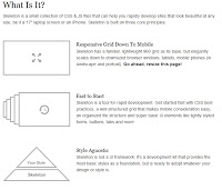
He also discussed responsive design, (such as Skeleton, pictured here) which allows for flexible layouts, dynamic images and and media queries to serve the same content over different devices. However, only a small percentage of mobile browsers can run responsive design. (In global brands with a large feature phone audience, this may be a deal breaker.) You need to decide what is the best strategy for you based on your consumers. Look at your web analytics to see what browsers and devices are visiting your site presently.
In the second half of the workshop, Gates discussed more mobile web design basics such as:
Key information about your users to gather (device, context, reason for use, time spent on site, level of interaction), develop personas for these users
How the design will be used - for example, how will the phone or tablet be held, portrait or landscape? Is the navigation easily accessible in this format?
How the site will add value - ultimately this is going to be a deciding factor in the success of a mobile website. Given the use circumstances, what value will it add?
When it comes to strategy, Gates suggests you "forget everything you think you know." Forget the latest hype, tool or technology, ask the hard questions about your business and your development capacity. Don't rely on preconceived notions, ask your users in context about their usage. Don't convert, create and keep it simple. Put consumer needs first. Finally, don't get stuck on the platform or device, test what you build, and think about having a holistic mobile plan.
When it comes to content, we discussed some basics around the importance of content for mobile and the ways that mobile and social media have redefined the idea of content. Good content is:
Appropriate
Useful
User-centered
Clear
Supported (and Factual and Up To Date)
When it comes to the future of content Gates discussed the new "State Aware Experience Design" enabled app from Starwood Preferred Guest (SPG). For more on that, visit his blog or the press release.
Lastly, we looked at some examples of good mobile design. Commonalities included: minimal navigation, clear usability with easy-to-read, large icons, and app-like features.
The final takeaways of our afternoon workshop were:
Decide what devices to support
Invest in a content strategy and have a holistic plan
Test and use prototypes
Use state aware user experience design to build customer experiences
Traditional Design and Development techniques still apply (with some vaiations)
Determine user context and goals
For more live coverage from the event, check out the stream on twitter at #TMMC. Michelle LeBlanc is a Social Media Strategist at IIR USA with a specialization in marketing. She may be reached at mleblanc@iirusa.com
