Market Research Infographics
Infographics: From fad to fail to forward thinking

Everyone loves a pretty picture. They instantly grab our
attention and force us to take a closer, more in-depth look. Indeed, I used my
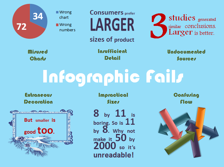
incredible graphic design skills (PowerPoint!) to create a visualization just
for this blog and I'm sure you've already taken a peek at it.
attention and force us to take a closer, more in-depth look. Indeed, I used my
incredible graphic design skills (PowerPoint!) to create a visualization just
for this blog and I'm sure you've already taken a peek at it.
Like the rest of the world, market researchers are keen to
take advantage of the power of data visualization. Traditionally, our
visualization tools have included bar charts, pie
charts, line charts, and a few other (not-so) fancy tricks that we scatter throughout
our reports with the sole intention of breaking up massive collections of text and tables and hopefully making everything a little more understandable.
Recent years have opened our eyes to a new world of infographics but a quick internet search for 'Infographic
Fail' reinforces the point of my infographic. We've yet to crack that
nut. Our attempts at data visualization in the form of infographics continue to fail in many regards from pointless
decoration, silly fonts, and ridiculous font sizes, to insufficient detail and no
documentation. They continue to stress design over content.
I love a good visualization as much as the next person and would love
to see market researchers spread the joy of numbers and analysis through them.
But as a group, we are severely lacking in those skills. And don't argue with
me about that. You just need to look at my infographic. It's a complete fail. Yet it
represents the utmost level of my artistic talent and creativity.
Researchers have
been trained to analyze, synthesize, and storyize data. Not color it, dress it
up, and make it museum ready. Our industry desperately needs artists,
graphic designers, artists, and animators who LOVE and understand numbers. We have these wonderful people in our marketing department so why aren't they regular contributors to our research departments?
So I challenge you. As you look forward to your next 5000 page report, consider how much more powerful it would be if you pulled in a teammate from the marketing department.
Needless to say, I'll see you at Alisa Olander's Data
Visualization presentation (10am, Monday May 19, #FOCI14). I may never acquire
the essential artistic skills but at least I'd like to know how those with the skills do
the work.
Visualization presentation (10am, Monday May 19, #FOCI14). I may never acquire
the essential artistic skills but at least I'd like to know how those with the skills do
the work.
Annie Pettit, PhD is the Chief Research Officer at Peanut Labs, a company specializing in self-serve panel sample. Annie is a methodologist focused on data quality, listening research, and survey methods. She won Best Methodological Paper at Esomar 2013, and the 2011 AMA David K. Hardin Award. Annie tweets at @LoveStats and can be reached at annie@peanutlabs.com.

