Wal-mart's Innovative Logo

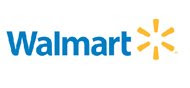 For the past 17 years, Wal-mart has used its old logo with uppercase letters and an unoriginal star that served as a hyphen. When compared to other companies like Target, which has its trademark bulls-eye, Wal-mart's logo seemed generic, but now after nearly two decades it seems as if Wal-mart has finally redesigned its logo. This article in Business Week points out that Wal-mart has decided to discontinue using the old logo that consisted of pointy letters, and have instead created a new logo with rounded lowercase letters, and have added a symbol after it that resembles a flower or a sunburst. Tobias Frere-Jones, a professor of typography at Yale University notes: "They seem to be going for something friendlier" Tobias has been employed by several other companies to create such designs in order to make businesses seem gentler. This logo has also come at a time in which Wal-mart is suffering damages from a Minnesota labor case. Another added factor is consumers are thinking 'green', and so the sunburst makes Wal-mart seem more eco-friendly. But, is a new logo and branding enough to change peoples' perception of a company? Only time will tell.